
Rebranding Melcochudas
Melcochudas is an artisan bakery in Medellín specializing in soft-textured cookies. Nobody commissioned this rebrand: I proposed it on my own initiative, and once the owner saw the proposal she decided to adopt it as the brand’s identity.
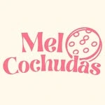
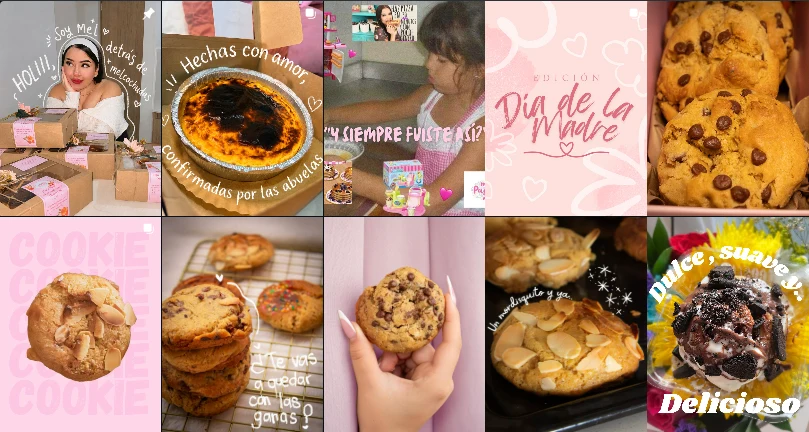
The problem was not the old logotype, which was competently made, but that there was no system behind it. Twelve posts carried at least six typefaces, pinks running from pastel to fuchsia, and photography swinging from blown out to almost dark. No two pieces looked like they belonged to the same brand.
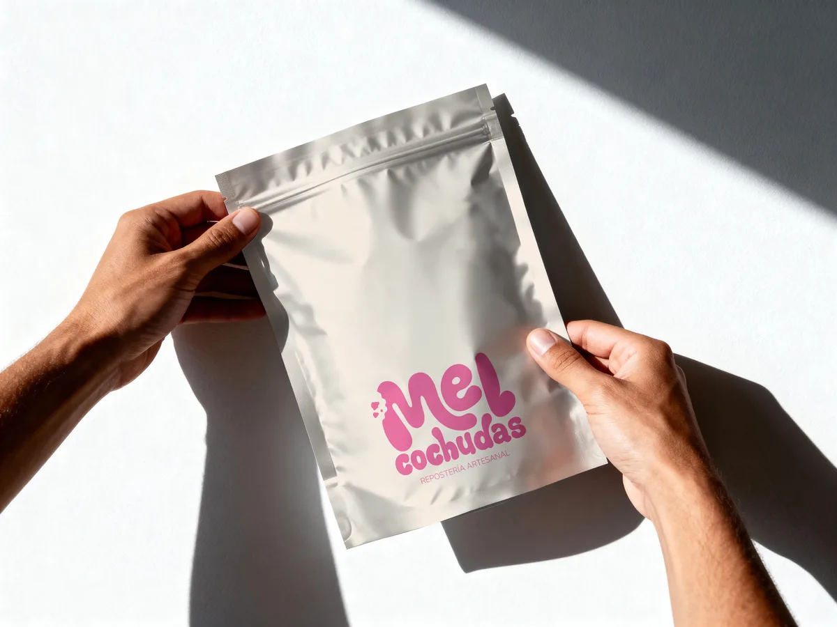
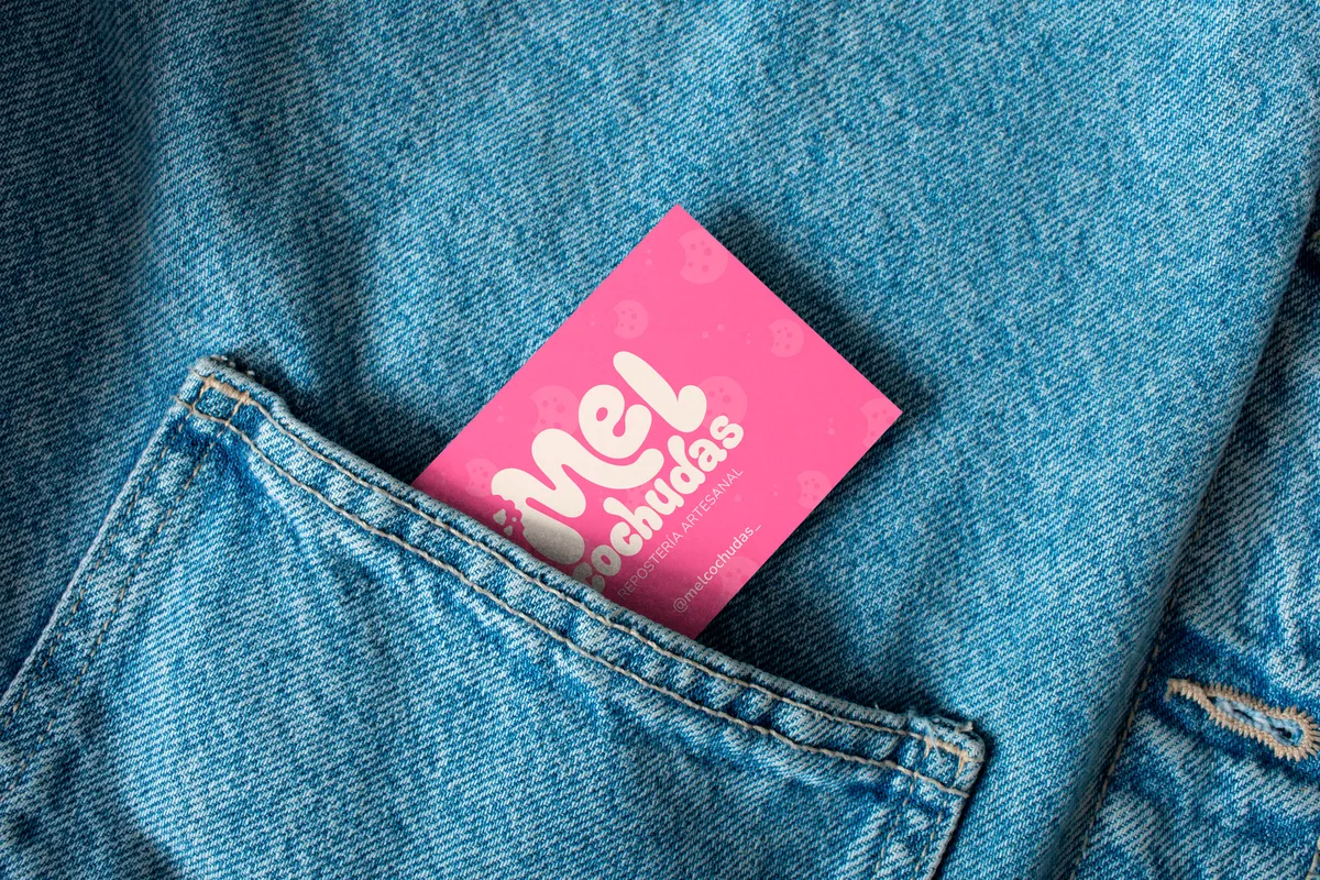
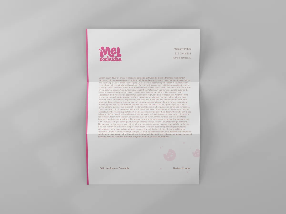
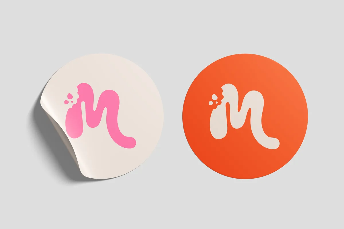
The work covered the logotype, a redrawn brand character, a more versatile typeface and a restructured packaging system. All of it is documented in an identity manual, which is what keeps the problem from coming back: a system is only worth something if someone else can apply it without guessing.
Where it started
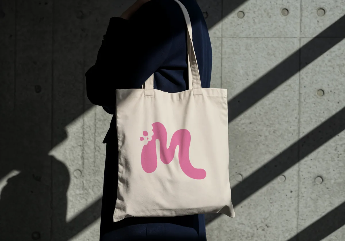
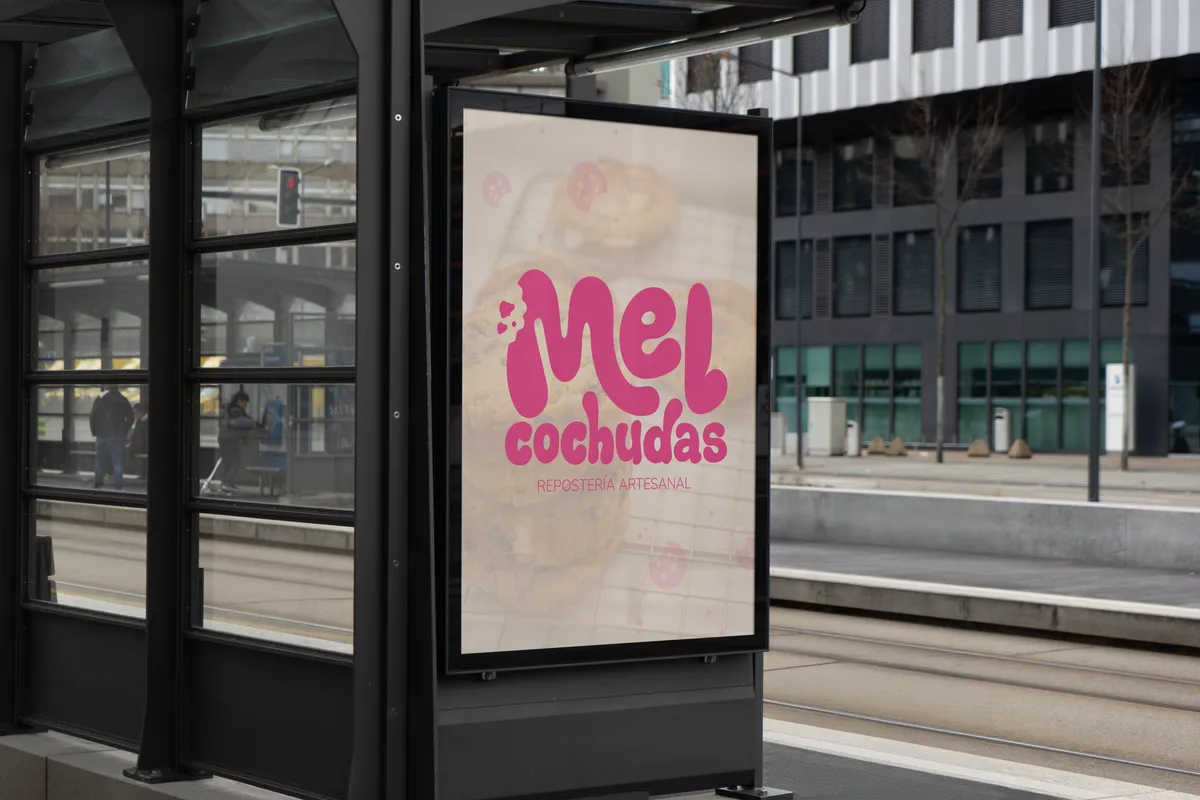
The brand applied
Full brand manual
Loading manual…